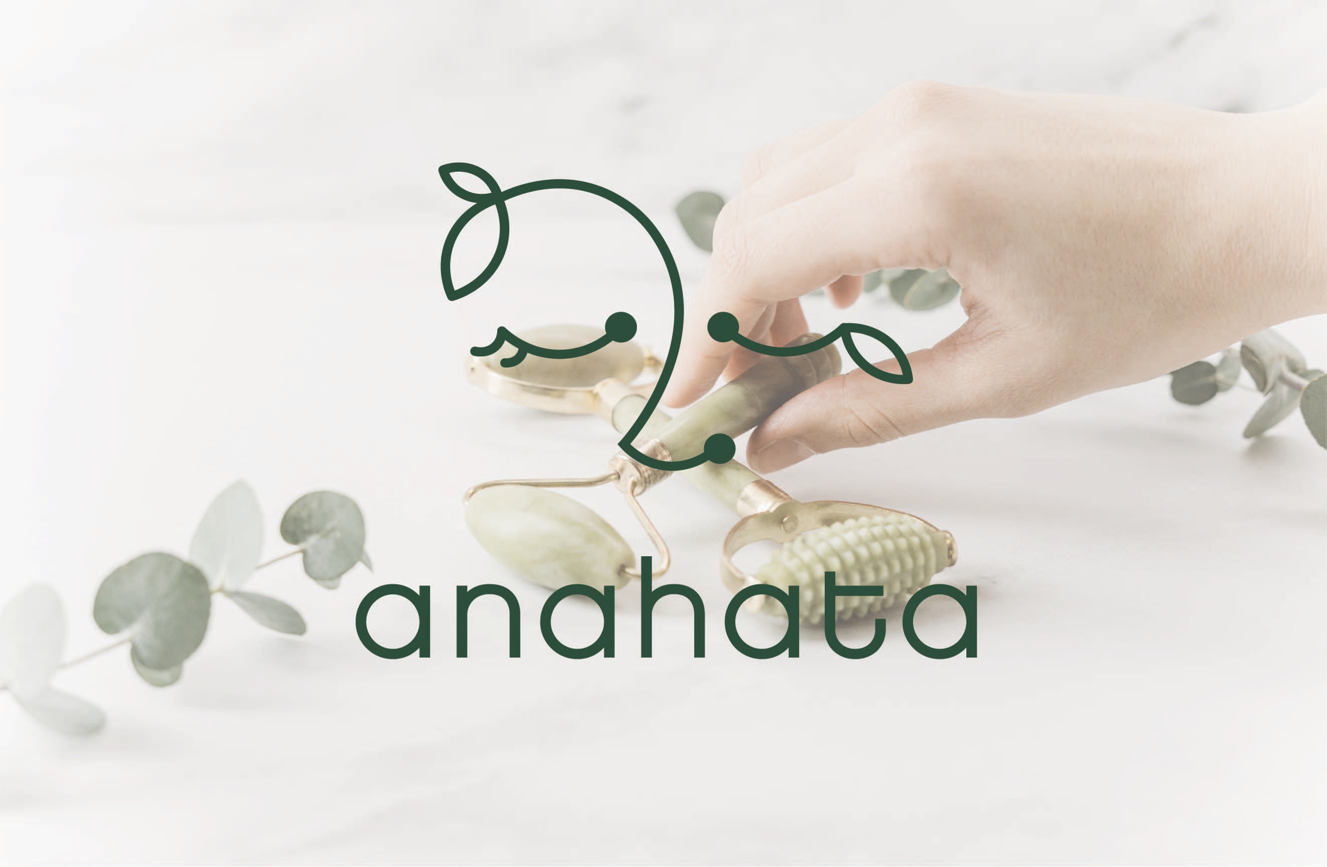
Anahata was designed for a brand offering a natural, calming skincare experience — an identity built to feel as gentle and unhurried as the ritual itself.
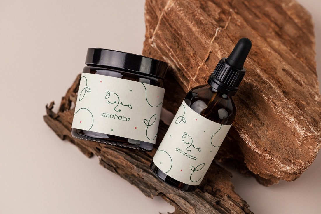
A simple, lowercase logotype sets the tone: soft, rounded letterforms with no hard edges, paired with a hand-drawn leaf motif that threads through the mark and repeats quietly across every surface of the packaging.
A muted, earthy green carries that same sense of naturalness and care throughout the identity, grounding the brand in something calm and organic rather than clinical.
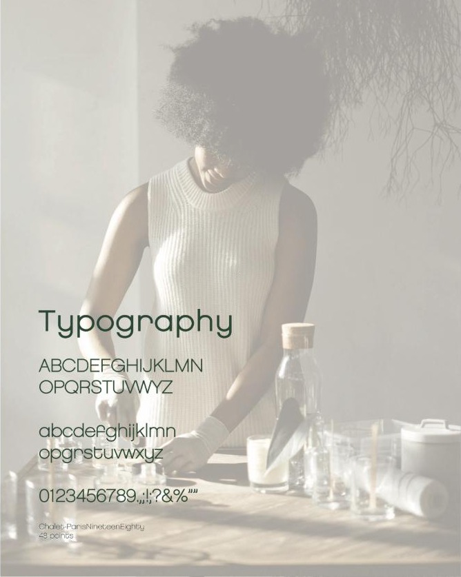
The lowercase wordmark and its supporting typeface share the same soft, rounded character — nothing sharp, nothing shouting.
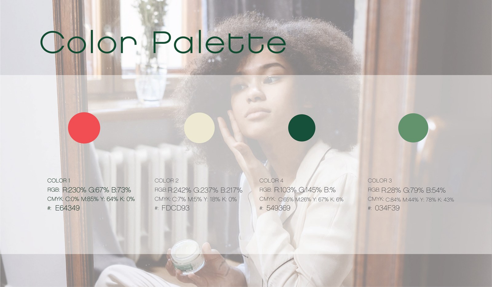
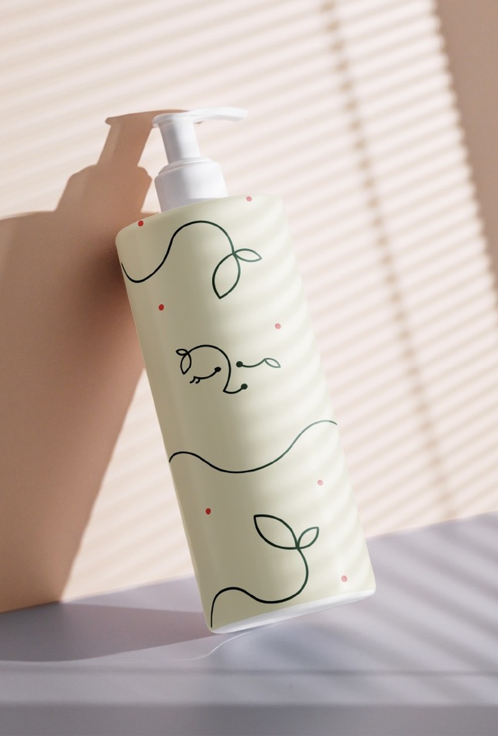
A warm coral against cream and two shades of botanical green — energetic in small doses, calm everywhere else.
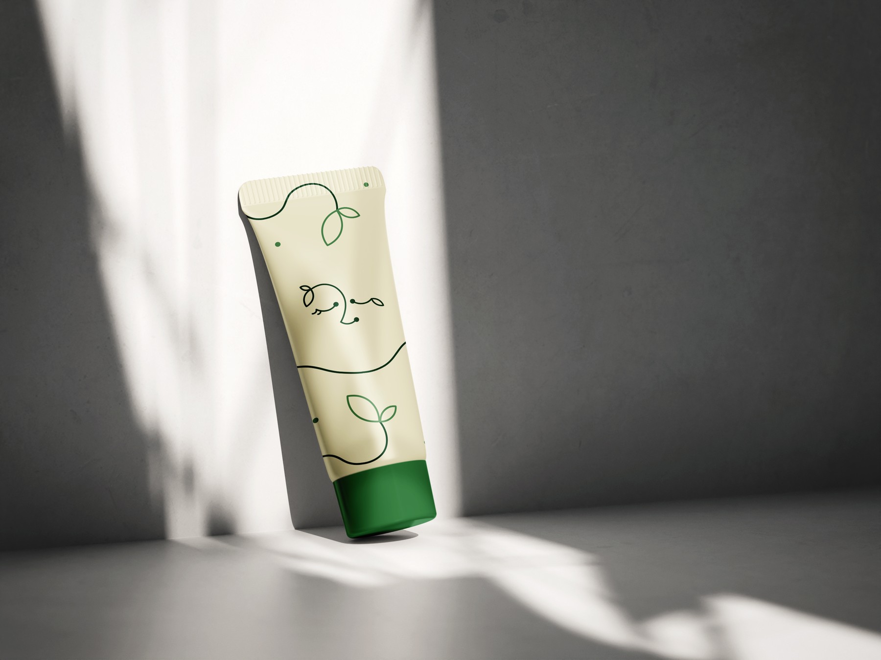
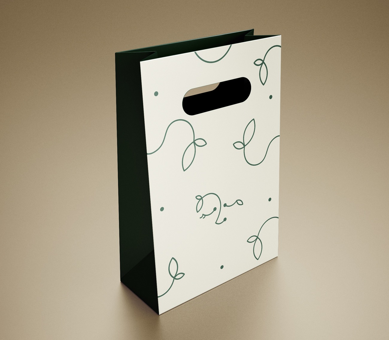
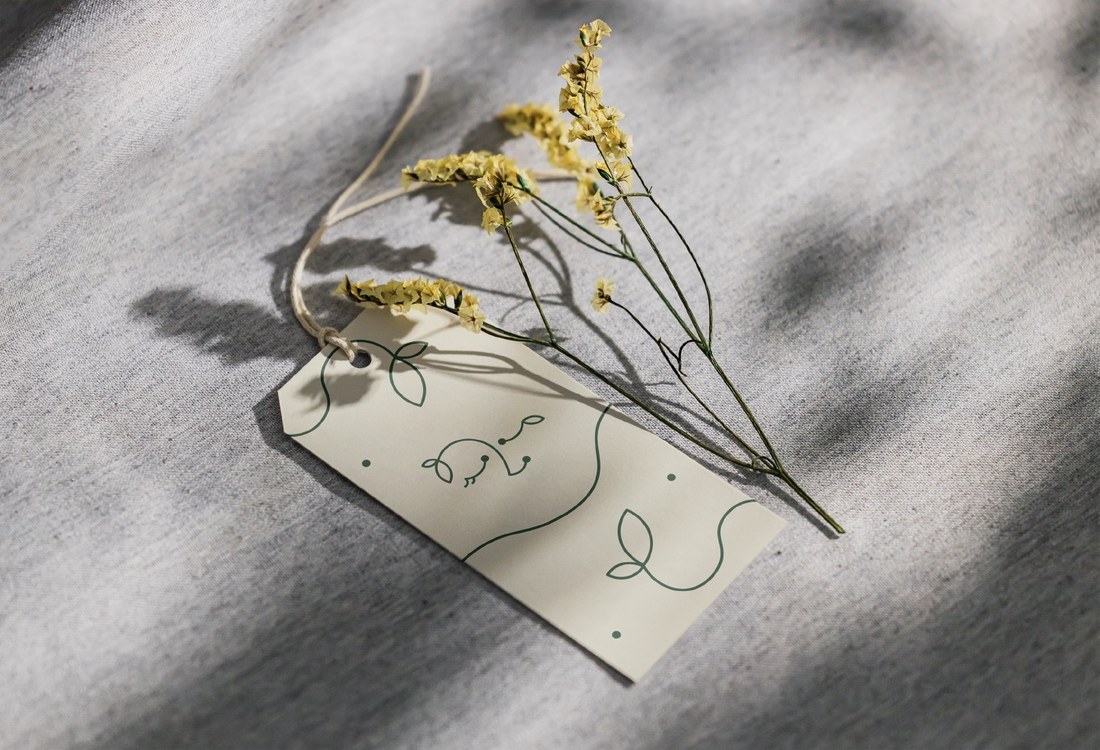
A fine-line leaf motif, drawn by hand, becomes the identity's recurring signature — winding across packaging and collateral alike.

The line illustrations and lowercase logotype carry through onto the product itself, finished in a soft cream and deep botanical green.
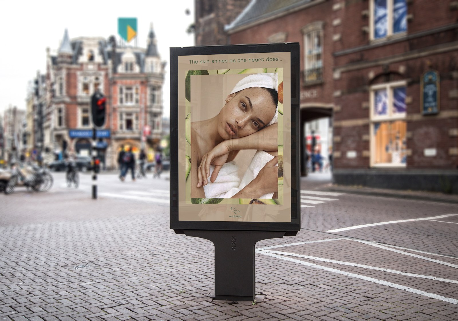
The identity extends into out-of-home advertising — the same quiet, editorial tone carried onto the street.