Behind Savira Hotels' finished identity sits a full naming, logo and color development process — the studies and reasoning that shaped how Belek Beach Resort would be seen, named and felt.
The goal was to move the brand toward a more refined, international and timeless position: an identity that carries the Mediterranean's natural character, the warmth of sunlight and a sense of vitality — through name, mark and color alike. Several full naming directions were developed and tested in parallel before Savira was chosen as the final identity.
- Art Direction — Alara Akkın, Tutku Tulga
- Naming Study
- Logo Design
- Color Identity
The full presentation decks behind this identity — naming and logo studies, the later revision rounds, and the color palette alternatives — are collected below exactly as they were presented, page for page. Click a cover to open it.
The naming process explored several directions before Savira was chosen — each tested with its own logo language, color world and mockup applications, so the final decision could be judged on how it would actually live across a hotel's signage, linens and print.
Savira paired a circular, single-line leaf-and-flamingo icon with a refined serif wordmark, built around the coastline's natural rhythm. Alongside it, Aliva and Souge explored a more literal flamingo silhouette and a geometric monogram; later rounds tested Bodon and Maera, each carrying the same circular icon language into a different name and tone. Savira's warmth, ease of pronunciation across markets, and the versatility of its mark made it the direction carried through to the finished identity.
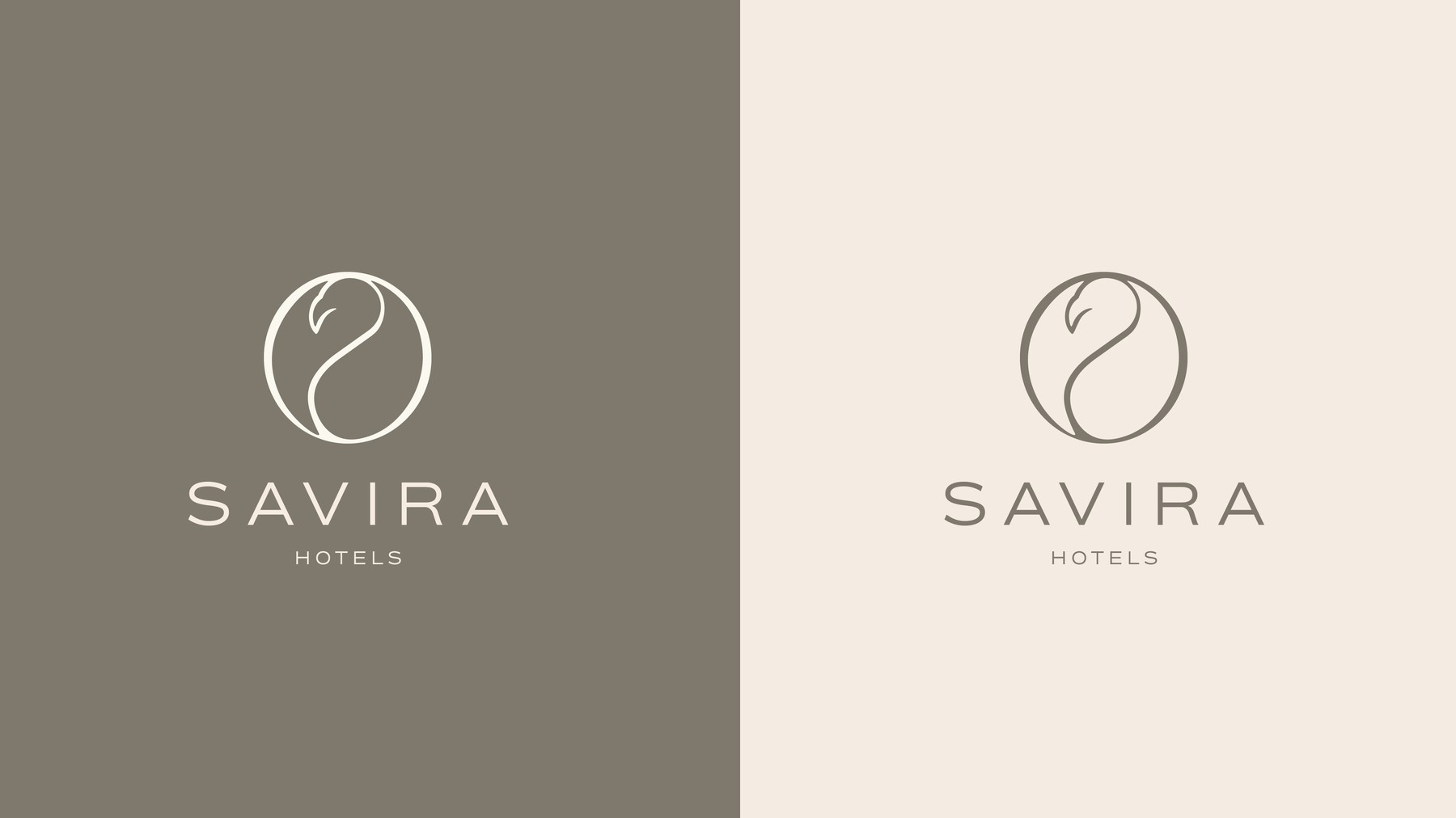
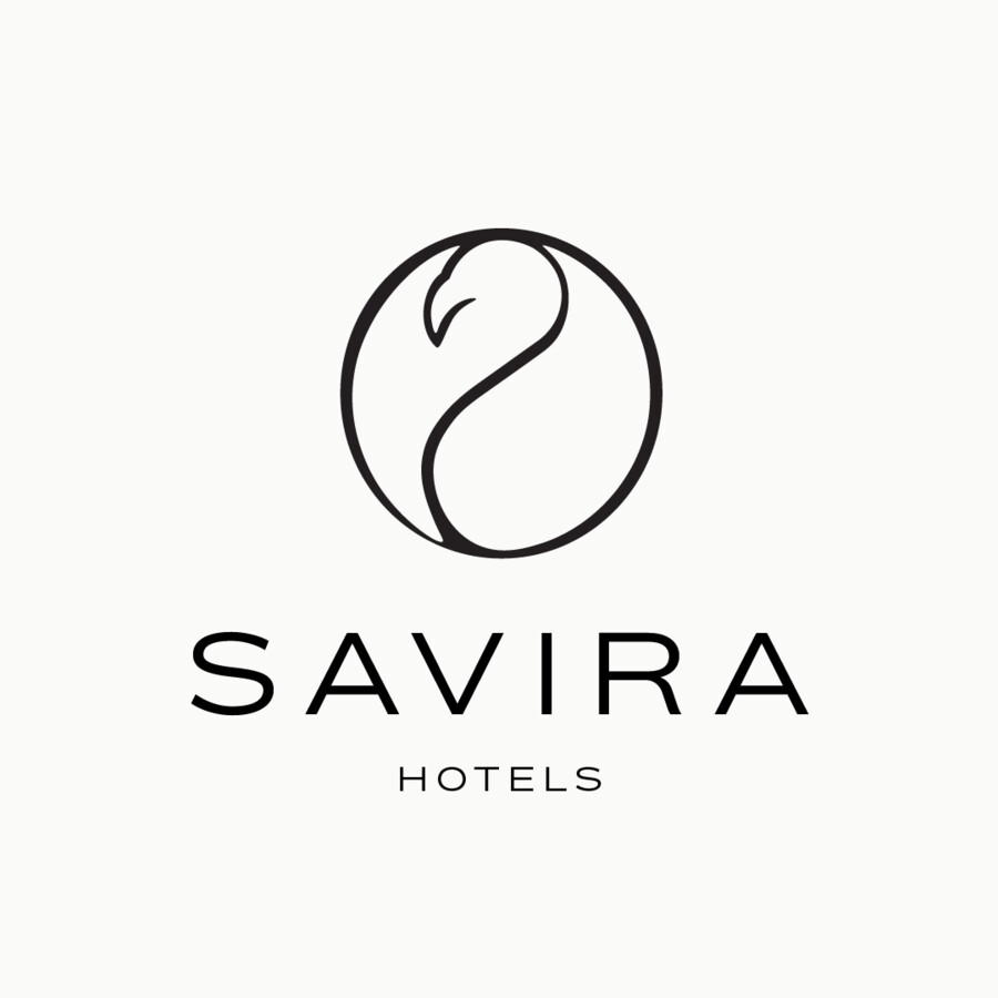
The mark pairs a single-line leaf motif, curved into a circle and shaped with a quiet nod to a flamingo in flight, with a clean, wide-set uppercase wordmark beneath. The icon's open, flowing line echoes the same warmth and movement carried in the name itself — a form simple enough to travel across a hotel's full identity system, from signage to linens to a beach umbrella.
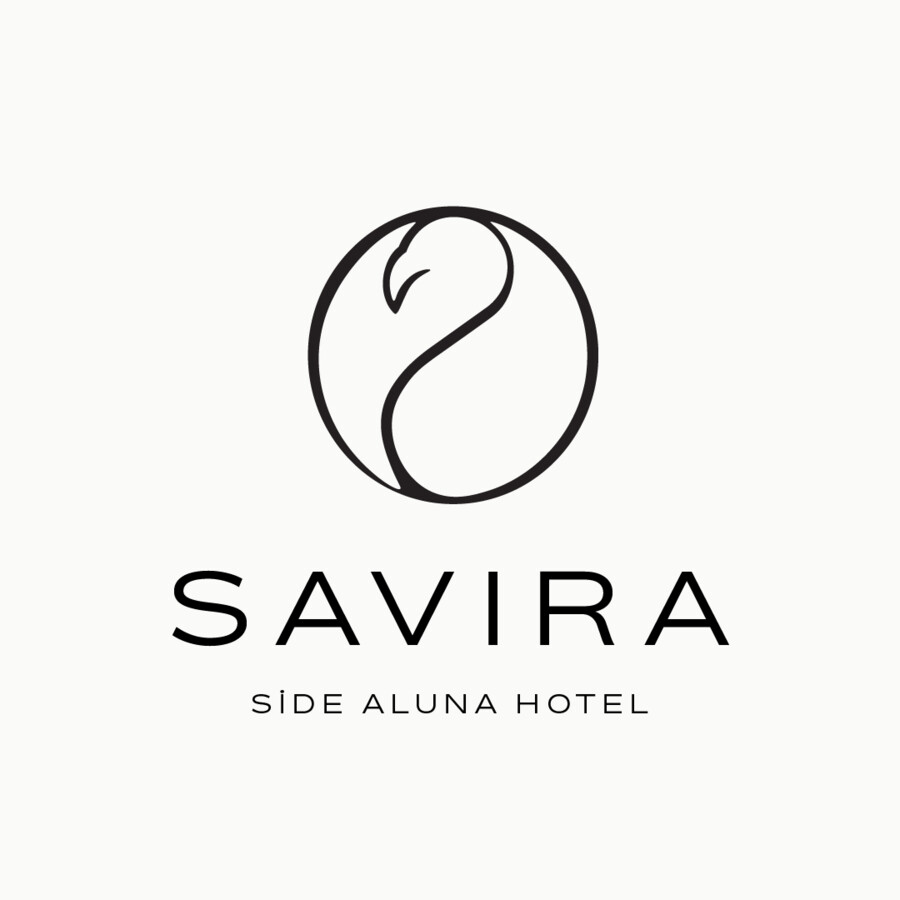
Because Belek Beach Resort sits within a wider hotel group, the logo was also built as a system: the same mark, set above "Belek Beach Resort," "Side Aluna" or "Elite," extends the identity cleanly across the group's other properties and tiers.

The color palettes developed for Belek Beach Resort were built to define not only the brand's visual identity, but also its feeling and experience — each one drawing on the hours of the day, the texture of the coastline and the atmosphere the space aims for. Four full alternatives were explored, each shifting the balance between luxury, nature and character before the studio settled on the final direction.
COLOR
"Each palette was built from the hours of the day, the texture of the coastline and the atmosphere the space aims for — not just a destination, but a world with its own aesthetic and language."